NO AI TRAINING: Without in any way limiting the author’s exclusive rights under copyright, any use of this content to “train” generative artificial intelligence (AI) technologies to generate text is expressly prohibited. The author reserves all rights to license uses of this work for generative AI training and development of machine learning language models. This content is not made using generative AI.
Happy Disability Pride month! For this month’s post, I want to walk through the fairly new Disability Pride flag, where it came from, and what it means.
Table of Contents:
History of the flag
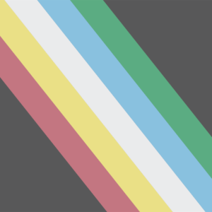
The most widespread flag (pictured here), is actually not the first or only Disability Pride flag. However, as it is the most-used one, I will be focusing solely on it, but you can find more information on other iterations on Wikipedia.
This flag was designed by disabled writer and activist Ann Magill in 2019. She wanted disability movements, and especially pride in them, to be more publicly visible.
Originally, the flag was more visually jarring than it is today. As you can see here, the colors were bolder, and the stripes were zig-zagged rather than straight. So why the change?
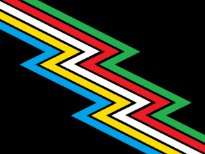
Well, it was actually a moment of the disability community coming together to add more value to the Disability Pride flag’s meaning. When viewed on some screens and devices, the sharp colors and squiggly lines could actually be triggering for folks with visual sensitivities. In other words, the flag’s design wasn’t fully accessible to the disability community.
So, with a lot of community input, the flag was redesigned. The colors were toned down, and the lines were straightened. The red and green stripes were also separated to accommodate the most common form of color blindness. Thus, the current Disability Pride flag was born. And personally, I like the newer design. It’s easier to look at and I prefer the more muted colors.
An act of accessibility: the public domain
Magill’s entire goal was to uplift the visibility of our community and provide us a symbol that could help unite us. So she understood very well that this design shouldn’t be carefully guarded. She immediately waved her copyright and entered the flag’s design into the public domain.
This means that anyone is free to use the design, riff on it, and sell it. I take great pleasure in this small act of accessibility and community wealth.
(Post continues below)
Don’t want to miss a post? Subscribing helps me out and ensures that you receive email updates for every post, with no extra unwanted emails. Be sure to check your inbox for a verification email.
What do the colors of the Disability Pride flag mean?
As with most Pride flags, the specific colors chosen all have their own meaning. Why those exact colors, though, I don’t know! If anyone does, I’d love to learn.
Charcoal grey: grief and rage
The dark background of this flag represents the grief, rage, and loss so many of us have felt due to ableist violence. Whether this be direct attacks on life, those lost to suicide, or victims of ableist abuse, our community will not forget those we’ve lost and the pain we’ve suffered.
Red: physical disabilities
When most people think “disability”, this is usually the category they jump to first. It’s often the most visible. Mobility impairments, lost or differently-formed limbs, chronic pain, and more fall under this category.
Gold: neurodivergence
Sometimes referred to as neurodiversity (although they’re different terms), this stripe represents all the folks whose brains are wired differently than the accepted norm. Autism, ADHD, OCD, Tourette’s, and more are represented by this gold.
White: invisible/undiagnosed disabilities
This is my personal favorite stripe. For every known disabled person you’ve met, you’ve probably met at least two more that you don’t know are disabled. So many of us have disabilities that aren’t immediately visible, and are thus less recognized. The stripe also acknowledges the countless people who can’t get a professional diagnosis of their disability due to ableism, financial barriers, and intersecting oppressive systems. Many neurodivergent conditions fall under this umbrella, as can chronic pain, chronic illnesses, and many, many more.
Blue: emotional/psychiatric disabilities
The blue stripe represents those who live with mental health conditions and other emotional or psychiatric differences that can be disabling. Depression, anxiety, schizophrenia, personality disorders… the list goes on and on. (Side note: even I fall into the temptation/need to use the word disorder! Ugh)
Green: sensory disabilities
This stripe is for anyone with sensory-related disabilities. This could mean reduced functioning in certain senses, as is the case for Deaf and blind folks. It could also mean heightened sensory sensitivities, or those for whom certain sensory inputs can trigger other conditions.
As we’ve seen in other Pride flags, designs tend to shift over time. The current design is only four years old. I’m very curious to see how it may shift in the future. Will the colors change? Will we see acknowledgment of the way BIPOC disabled folks are further marginalized? I don’t know, and that’s part of the fun!
What’s your favorite part of the Disability Pride flag? Do you have questions about it? Let me know by leaving a comment below. And if you liked this post, make sure to subscribe so you don’t miss the next one.
